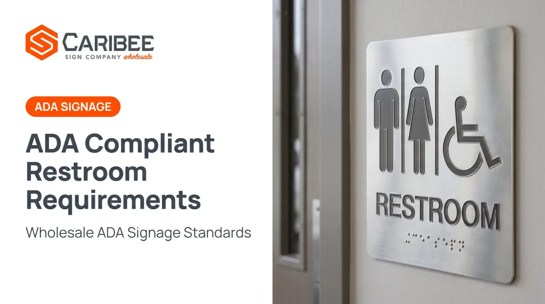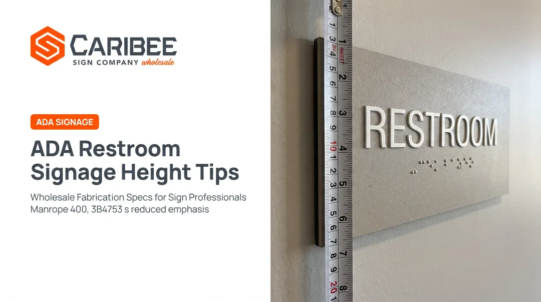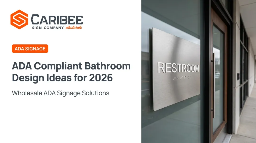

That gap causes real problems. Many sign companies and business owners assume any female pictogram paired with visual text satisfies accessibility law. It doesn't. Federal and state ADA codes dictate exact tactile height, Braille placement, contrast, and mounting specifications, and getting even one wrong can trigger a failed inspection or a rejected installation.
This post breaks down where the women's restroom symbol came from, what it means today, and the specific technical rules that govern it, so you can order or produce signage that actually passes muster.
Key Takeaways
- The ♀ pictogram comes from astrology; Linnaeus formalized it in 1751, not antiquity.
- ADA requires raised tactile characters and Grade 2 Braille on restroom signs—not only a pictogram or print.
- Mounting height, latch-side placement, and non-glare finish are federal rules, separate from state add-ons like California's geometric symbols.
- Working with an ADA signage manufacturer like Caribee Sign helps avoid redesigns and rejected installs from missed specs.
The History and Meaning Behind the Women's Restroom Sign
Where the Female Symbol Originated
The ♀ glyph likely developed from contracted Greek letters used to abbreviate planet names in astrology and alchemy, with Venus specifically linked to the sign later associated with femininity.
Popular claims pin an exact origin date around 500 BCE, but that specificity isn't backed by the historical record.
What's actually documented: Swedish naturalist Carl Linnaeus was the first to use the symbol biologically, introducing it in Plantae Hybridae in 1751 and applying it regularly in later works to denote female flower parts.
That's the real starting point for the symbol's scientific use, centuries before anyone connected it to a restroom door.
How the Symbol Became the Universal Restroom Icon
The circle-head, triangle-skirt figure most people picture didn't come from one single design team. It emerged from the broader mid-20th-century pictogram movement, when transit systems and public buildings across Europe and the US began adopting simplified visual symbols to communicate across languages.
In the US, that movement formalized in 1974 when the American Institute of Graphic Arts, working with the Department of Transportation, published a standardized set of pictograms designed by Roger Cook and Don Shanosky.
AIGA released 34 symbols that year and 16 more in 1979. The copyright-free set became the de facto American standard for public wayfinding, including restroom identification.

What the Female Sign Represents Today
The ♀ symbol represents female biological sex and feminine gender identity. It's used in medicine, biology, and demographic shorthand, and it doubles as restroom signage shorthand for facilities designated for women.
Compare it to its counterpart:
| Symbol | Origin | Primary modern use |
|---|---|---|
| ♀ (female) | Venus/alchemy sign, formalized by Linnaeus | Biological sex, gender identity, women's facilities |
| ♂ (male) | Mars/alchemy sign, same Linnaean formalization | Biological sex, gender identity, men's facilities |
The symbol carries cultural weight, too. Feminist activists adopted modified versions, such as a raised fist inside the ♀ circle, as an empowerment emblem during the women's liberation movement of the late 1960s.
That history adds meaning beyond the restroom door, though not every plain restroom pictogram carries that political charge.
This dual identity, biological shorthand plus cultural symbol, is part of why some businesses are now exploring gender-neutral signage as an alternative or supplement. More on that shortly.
ADA Compliance Requirements for Women's Restroom Signs
Restroom door signs fall under "identification" signage, a different legal category than wayfinding signs like directories or exit arrows. Identification signs must be tactile; general wayfinding signs only need to meet visual requirements. Confusing the two categories is one of the most common compliance mistakes sign companies make.
Tactile Characters and Braille
Federal ADA rules under Sections 703.2 and 703.3 spell out exact dimensions:
| Element | Requirement |
|---|---|
| Character relief | Raised minimum 1/32 inch, uppercase, sans serif |
| Character height | 5/8 inch to 2 inches (measured on uppercase "I") |
| Stroke thickness | Max 15% of character height |
| Braille dot height | 0.025–0.037 inch, domed |
| Braille placement | Directly below text, minimum 3/8 inch from other elements |
These aren't suggestions. A sign with printed vinyl lettering instead of raised characters, or Braille placed above the text instead of below it, fails inspection regardless of how good it looks.
Contrast, Finish, and Pictograms
The ADA requires a non-glare finish with either light-on-dark or dark-on-light contrast between characters and background. The 2010 ADA Standards set no specific numeric contrast ratio, so be skeptical of any vendor advertising an exact percentage as "the ADA standard."
If a pictogram identifies the room, it needs a 6-inch-minimum field with no characters or Braille inside it, plus a separate tactile and Braille descriptor placed below.
State-Specific Add-Ons
Some states layer additional requirements on top of the federal baseline. California, for example, mandates a 12-inch-diameter circle at women's restroom entrances (a triangle for men's, and a circle-with-triangle for all-gender facilities), centered 58 to 60 inches above the floor. That's in addition to, not instead of, the federal tactile sign.

State code variations get missed constantly, and a rejected install means redesign cost. Caribee Sign specializes in ADA-compliant signage, with in-house Braille translation, raised character production, and tactile pictogram fabrication on every order.
Sign companies that partner with a manufacturer fluent in the federal-plus-state stack cut that rework risk before the sign ever ships.
Design Elements and Variations of Women's Restroom Signs
Pictogram Styles
Three styles dominate the market:
- Classic triangular "skirt" figure: the most recognizable option, widely used in retail and hospitality
- AIGA-standardized icon: the coordinated set used in transit and government buildings
- Minimalist geometric shapes: a plain circle or other abstract mark, increasingly common in modern commercial spaces
All three can satisfy ADA requirements as long as the underlying tactile text and Braille are correct. The pictogram style itself is a design choice, not a compliance variable.
Material and Finish Choices
Material affects durability, cost, and how well raised elements hold up over years of use:
- Stainless steel and brushed metal: durable, professional appearance, common in high-traffic commercial and healthcare settings
- Acrylic (translucent, frosted, or clear): cost-effective, modern look, well-suited to retail and hospitality branding
- Wood and custom substrates: used where the design needs to match interior finishes
Caribee Sign produces restroom signage across all of these materials, with raised tactile characters, tactile pictograms, and Grade 2 Braille applied regardless of substrate.
The Rise of Gender-Neutral Signage
More businesses are adding all-gender restroom options alongside traditional male/female signage, driven partly by local ordinances like California's AB 1732 and New York City's Local Law 79, which require gender-neutral signage on single-occupant restrooms. Caribee Sign offers gender-neutral pictogram signs alongside conventional male and female designs, so sign companies can source both from one wholesale partner.
Where and How to Properly Install Women's Restroom Signs
Mounting Height and Placement
A common misconception is that ADA signs mount at "60 inches to centerline." That's not quite right.
The federal rule sets the lowest tactile character baseline at 48 inches minimum and the highest baseline at 60 inches maximum above the finished floor. Plan sign layout around that range before you pick a mounting point.
Placement rules matter just as much as height:
- Mount on the wall at the latch side of the door, not the door itself, whenever wall space allows.
- If no latch-side wall space exists, use the nearest adjacent wall.
- Push-side door mounting is only acceptable if the door has a closer and no hold-open device.

Clear Floor Space
Signs need an 18-by-18-inch clear floor space centered on the tactile characters, positioned so the door swing never obstructs it. A sign that's technically compliant but blocked by an open door still fails a real-world accessibility check.
What Happens When Installation Goes Wrong
Enforcement cases show exactly how these errors play out. In a Cedar Rapids, Iowa, settlement, the Department of Justice found a restroom sign with no raised or Braille characters at all, mounted on a door fitted with a hold-open device. That was a double violation of content and placement rules. The city had to correct the deficiency within six months.
A separate case in Hudson, New York, involved restroom signs lacking permanent raised and Braille identification on the wall adjacent to the latch side, requiring remediation across multiple park and department facilities. Missed raised characters, wrong wall, or a blocked approach can trigger the same kind of mandated fixes across a whole facility portfolio.
Choosing the Right Manufacturing Partner for Women's Restroom Signage
A general print shop can make a sign that looks right. Getting one that's actually compliant, with correct raised character height, properly translated Grade 2 Braille, and the right finish and mounting spec, requires a manufacturer that lives in ADA code daily.
Why this matters for sign companies specifically:
- Rejected installations cost time, materials, and client trust
- Multi-location rollouts multiply small errors across dozens of sites
- State-specific add-ons (like California's geometric symbols) are easy to miss without dedicated review
Caribee Sign operates as a trade-only wholesale manufacturer, meaning it never competes for your end clients. It builds signage in-house in St. Louis, with Braille translation included on every order, so sign companies don't need Braille expertise on staff.
Quote turnaround typically runs within one business day, with production and delivery averaging two to three weeks. As one wholesale partner, Hugh-Carolina Sign Co., put it: Caribee is their "go-to" company for all of their ADA signage needs, citing responsiveness and consistent product quality.
Before ordering from any vendor, ask:
- Do they offer in-house Braille translation, or does that fall on you?
- What's their typical quote and production turnaround?
- Can they support consistent signage across multiple locations or states?
- Do they review artwork and specs for state-specific code variations before production?
Frequently Asked Questions
What gender is the female sign (♀)?
The ♀ symbol represents female sex and gender. It began as the astrological and alchemical sign for Venus, was adopted in biology by Linnaeus in 1751, and later became the standard mark for women's facilities.
What do the male (♂) and female (♀) signs mean?
Both symbols originated as planetary signs in astrology and alchemy before Linnaeus adopted them for biology in the 1700s. Today they denote male and female sex or gender in medicine, demographics, and public restroom signage.
Are gender-neutral restroom signs required by law in the US?
Not universally. There's no blanket federal mandate, but states like California and cities like New York require gender-neutral signage on single-occupant restrooms. Gender-neutral or not, any tactile sign must still meet ADA Braille and character rules.
What ADA regulations apply specifically to restroom identification signs?
Restroom ID signs need raised tactile characters and Grade 2 Braille below the text. They also require a non-glare finish with light/dark contrast, mounted 48–60 inches to the tactile baseline on the latch side of the door.
Can businesses use a custom or decorative symbol instead of the standard pictogram?
Yes, custom designs are allowed as long as they still meet the underlying ADA and any applicable state technical requirements for tactile text, Braille, and contrast. The pictogram style is flexible; the compliance specs aren't.
How high should a women's restroom sign be mounted?
The tactile character baseline should sit between 48 inches minimum and 60 inches maximum above the floor, mounted on the latch side of the door. California adds a separate geometric symbol requirement centered 58 to 60 inches above the floor.