
Healthcare facilities face wayfinding challenges that retail stores and office buildings never have to solve. Patients arrive stressed, sometimes in pain, often unfamiliar with medical terminology. Hospitals also carry strict ADA obligations that don't apply to a typical strip mall.
This guide breaks down the core sign types every hospital needs, the design principles that keep visitors oriented, and the ADA rules that make healthcare signage a legal requirement, not a nice-to-have.
Key Takeaways
- Clear wayfinding reduces patient stress and frees staff from constant direction-giving throughout the day
- Four sign types (identification, directional, orientation, and regulatory) form the backbone of every hospital system
- ADA compliance (raised characters, Grade 2 Braille, correct mounting height, high contrast) is a legal requirement
- Kiosks and apps work best as a layer on top of physical signage instead of replacing it
- Working with an ADA-focused signage manufacturer keeps large facilities consistent and reduces compliance risk
Why Wayfinding Signage Matters in Hospitals
Getting lost in an unfamiliar building is annoying. Getting lost in a hospital, while worried about a diagnosis or running late for a procedure, is something else entirely.
Human-factors researchers have studied why people lose their bearings in large buildings for decades. Long, repetitive corridors and buildings expanded over decades (a wing here, a tower there) create exactly the kind of layout that confuses even attentive visitors.
Hospitals, more than almost any other building type, tend to grow this way.
The Cost of Confusion
Poor wayfinding shows up in ways administrators can measure:
- Staff time lost to direction-giving, pulling clinical staff away from patient care
- Missed or delayed appointments when patients can't find the right department in time
- Visitor and patient anxiety, layered on top of whatever brought them to the hospital in the first place
One 2024 study at a large teaching hospital found 83% of patients, attendants, and visitors rated the facility's sign system good or excellent. This shows a well-designed system is achievable, even in complex healthcare settings.
Healthcare facilities also deal with layout challenges most buildings don't:
- Multiple entrances and parking structures, each requiring its own routing logic
- Mixed public and clinical zones, where restricted areas sit next to open lobbies
- Departments and specialty wings that move, expand, or get renamed as the hospital grows
Each of these adds a decision point where a lost visitor has to guess or stop and ask, exactly where staff time gets eaten up.
The Four Types of Hospital Wayfinding Signage
A hospital's wayfinding system stands on four legs. Miss one, and the whole structure gets shaky. Identification, directional, orientation, and regulatory signage cover every navigational need from the parking garage to the fifth-floor cardiac unit.
Identification Signs
Identification signs mark a specific destination: a room number, a department name, an office. In a hospital, that means everything from "Radiology" and "Room 204" to break rooms and supply closets.
Because these mark permanent rooms, the ADA requires raised tactile characters and Grade 2 Braille, mounted at a specific height beside the door.
Caribee manufactures these signs for exam rooms, operations offices, and general room numbering. Materials range from a virtually limitless range of substrates, including architectural films, high-pressure laminates, metal surfaces, aluminum composites, engraving plastics, acrylics, and more, so a hospital's identification system can match its interior design instead of looking bolted on.
Directional Signs
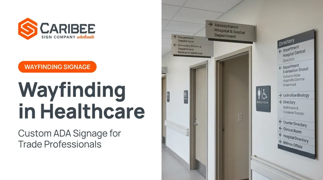
Directional signs do their job at decision points: hallway intersections, elevator lobbies, the fork where the path to the emergency department splits from the path to outpatient surgery. They rely on arrows and short, unambiguous text.
Get these placed wrong, or worded vaguely, and visitors default to guessing. Multiply that across a multi-story tower with several wings, and it's easy to see how one missing directional sign creates a bottleneck of confused people asking staff for help.
Orientational Signs
Directional signs answer "which way?" Orientational signs answer "where am I, and how does this all fit together?" Lobby directories, floor maps, and "you are here" displays let visitors build a mental model of the building before they start walking.
A good directory mirrors the color-coding, floor-level cues, and naming conventions used everywhere else in the facility. That consistency means the map a visitor studies in the lobby actually matches what they encounter once they're moving through the building.
Regulatory and Life-Safety Signs
This category covers signage hospitals are legally required to post regardless of design preference: exit signs, fire evacuation routes, restroom signage, and postings around restricted or hazardous areas. Many overlap directly with ADA rules, since accessible restroom and evacuation signage both carry their own tactile and visual requirements.
This category gets treated as an afterthought more often than it should. A beautifully designed identification and directional system doesn't help much if the evacuation signage fails code.
Skip or shortcut any one of these four categories, and the gaps show up fast — usually as visitor complaints, staff interruptions, or a failed accessibility inspection.

Design Best Practices for Effective Healthcare Wayfinding
Good hospital signage depends on the system behaving consistently, not on any single sign. Visitors learn to trust that system within the first two or three signs they see.
Build One Consistent Visual Language
Every sign should share the same typeface, color palette, and icon set. When a parking garage's signage looks nothing like the lobby directory, which looks nothing like department signage, visitors have to relearn the rules at every turn. Consistency does the opposite: once someone understands the logic near the entrance, they can apply it all the way to the oncology wing.
Place Signs at Decision Points, Not Everywhere
Signage belongs at entrances, elevator banks, and hallway intersections — the exact spots where someone has to choose a direction. This is where progressive disclosure comes into play: give visitors the information they need for the next decision, not the entire route at once. A sign crowded with fifteen department names is harder to use than one naming the three relevant to that hallway.
Design Signage That Works for Every Reader
Icons paired with plain-language text serve a wider range of visitors than text alone. This matters in healthcare more than almost anywhere: 2019 Census data shows 22% of the U.S. population age five and older speaks a language other than English at home, and 8% speak English less than "very well."
Tested universal healthcare symbols help close that gap without requiring a sign for every language a hospital might encounter.
Use Color and Zones as Landmarks
Naming a wing "Blue Zone" or coding a floor's elevators in green gives visitors a memory anchor that doesn't depend on reading ability. Someone who can't recall whether they need "3 West" or "3 East" will usually remember they're looking for "the blue elevators."
Get the Legibility Fundamentals Right
None of the above matters if people can't read the sign. That means:
- Sans-serif fonts that stay legible at a distance and an angle
- Letter height sized to viewing distance
- High-contrast lettering against non-glare backgrounds, so reflections don't wash out text
These design principles only hold up long-term if they align with a set of rules that isn't optional: ADA accessibility requirements.

ADA Compliance: The Non-Negotiable Standard for Healthcare Signage
Private hospitals and doctors' offices are classified as Title III public accommodations under the ADA, which means their signage must meet specific legal requirements, not just design preferences. Healthcare facilities tend to draw more scrutiny than most because they serve populations with higher rates of disability and vision impairment.
The Core Technical Requirements
The U.S. Access Board's guidance on signage lays out specific, measurable rules for permanent room signage:
| Requirement | Standard |
|---|---|
| Tactile characters | Raised, uppercase, sans serif; generally 1/2 to 2 inches high |
| Braille | Grade 2 (contracted), positioned below the tactile text |
| Mounting height | Sign center between 48 and 60 inches above the floor |
| Mounting location | Typically the wall on the latch side of the door |
| Visual finish | Non-glare, with strong contrast between text and background |
Directional and informational signs generally need to meet visual contrast and character rules but don't require tactile content. This distinction trips up plenty of facilities managers who assume every sign needs Braille.
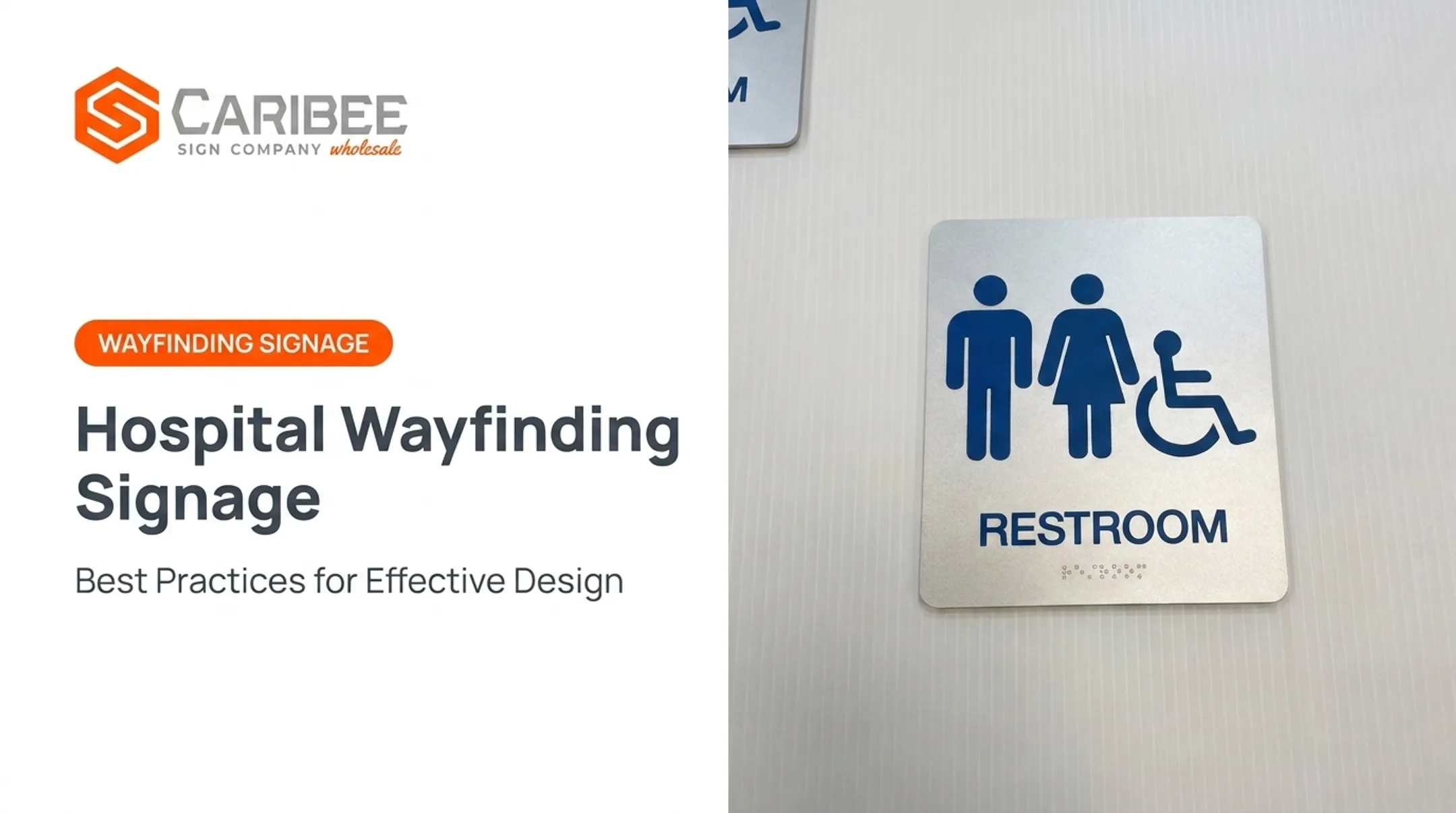
Pictograms carry their own rule: a symbol alone isn't enough. If a permanent room sign includes one, it also needs a raised, Brailled text descriptor below it. A wheelchair symbol alone doesn't meet code, but a wheelchair symbol paired with "Accessible Entrance" in tactile text does.
The Real Cost of Getting It Wrong
Non-compliance isn't hypothetical. In 2020, the Department of Justice reached a settlement with Tufts Medical Center requiring the hospital to add directional signage pointing to accessible restrooms and to post accessibility signage at entrances and designated patient rooms.
Healthcare facilities face this kind of scrutiny regularly, and compliance drifts over time. A department relocation, a renovation, or a new entrance can all leave outdated or non-compliant signs in place. A regular audit, at minimum annually and always after renovations or department moves, catches these gaps before a patient complaint or an inspection does.
Why the Manufacturing Partner Matters
Getting every dimension, Braille translation, and mounting spec correct across hundreds of signs is tedious, and small errors compound across a large facility. Caribee Sign builds its wholesale production process around this exact problem: in-house Grade 2 Braille translation, precision tactile character production, and consistent specs on every order. Sign companies serving healthcare clients can request a quote directly for hospital signage projects, typically hearing back within one business day.

Combining Physical and Digital Wayfinding
Modern hospitals increasingly layer digital tools on top of physical signage. Interactive kiosks let visitors search for a department and send directions to their phone. QR codes next to physical signs link to digital maps. Mobile apps, where hospitals have built them, offer turn-by-turn indoor navigation.
These tools add real convenience, but they come with real limits:
- Connectivity gaps: indoor GPS is unreliable, and hospitals are full of Wi-Fi dead zones near equipment-heavy areas
- Uneven adoption: older visitors are far less likely to download or use a navigation app
- Maintenance burden: kiosks need upkeep and hardware that eventually fails, unlike a printed sign
None of this makes digital tools a bad investment. It just means they work best as a layer built on top of physical signage. A visitor whose phone battery dies, who doesn't speak the app's default language, or who simply prefers reading a sign still needs a physical system that gets them where they're going.
The practical approach: treat ADA-compliant physical signage as the permanent backbone, and add kiosks, apps, or QR codes as a convenience layer on top. When the network goes down, well-placed physical signs keep guiding every visitor without interruption.
Frequently Asked Questions
What are the four types of wayfinding signage?
Hospital wayfinding relies on four sign types:
- Identification signs that mark rooms and departments
- Directional signs that guide movement at decision points
- Orientation signs like maps and directories
- Regulatory signs covering exits and safety requirements
What is the wayfinding system in a hospital?
It's the full network of signs, maps, and visual cues guiding patients, visitors, and staff from the parking lot to their destination and back. Physical signage forms the foundation, often supplemented with digital tools.
What ADA sign requirements apply to hospital wayfinding?
Permanent room signs need raised tactile characters and Grade 2 Braille, mounted with the sign center between 48 and 60 inches above the floor, with non-glare finishes and strong visual contrast.
How often should a hospital audit its wayfinding signage?
At minimum, annually, and always immediately after any renovation, department relocation, or new construction, when outdated or non-compliant signs are most likely to slip through.
Can digital signage replace physical wayfinding signs in hospitals?
No. Digital tools are useful supplements, but connectivity gaps, maintenance needs, and uneven adoption mean physical, ADA-compliant signage has to remain the foundation.
How much does hospital wayfinding signage typically cost?
Costs vary based on facility size, sign types, and materials. Most hospitals work with a signage partner to get a project-specific quote rather than relying on a general estimate.