
Wayfinding signage often gets treated as an afterthought, something to bolt on once construction wraps up. That's a mistake. Poor navigation shows up in patient stress, missed appointments, and staff pulled away from actual care to give directions.
This article covers the best practices that matter, what ADA compliance actually requires, and why getting wayfinding right pays off operationally.
TL;DR
- Consistent, accessible wayfinding cuts patient confusion and helps staff move through complex healthcare facilities faster
- Place signs at decision points, pair universal symbols with multilingual text, and meet full ADA requirements
- Poor wayfinding increases anxiety, delays, and staff time lost to giving directions
- Physical signage paired with digital tools creates the strongest navigation experience
- ADA-compliant healthcare signage depends on a manufacturing partner built for regulatory requirements
What Is Healthcare Wayfinding Signage?
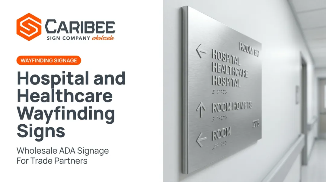
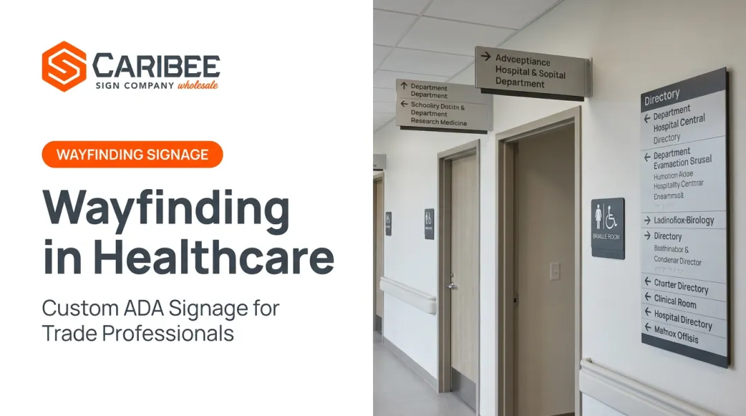
Healthcare wayfinding signage is the coordinated system of signs, symbols, and directional cues that guide people from entry to destination inside a medical facility.
You'll find it at:
- Building entrances and parking structures
- Elevator banks and stairwells
- Hallway intersections
- Department and room entries
Healthcare wayfinding is operational infrastructure. A well-designed system reduces anxiety and keeps operations running smoothly, especially where a wrong turn can mean a missed appointment or a delayed procedure.
Key Best Practices for Effective Healthcare Wayfinding Signage
These practices focus on outcomes you can actually measure: reduced stress, faster navigation, lower compliance risk.
Practice 1: Strategic Sign Placement at Decision Points
People need direction exactly where they pause to make a choice — not before or after. That means entrances, elevator lobbies, and hallway intersections. Pair those decision-point locations with consistent design standards (color, font, sizing) so visitors learn a visual language they can trust within minutes of walking in. A peer-reviewed review found that posted signs significantly improved emergency-egress speed compared to environments without them. The same research found patients exposed to posted signage in admitting areas made fewer demands on staff and were more knowledgeable about procedures and amenities. A 2018 medical-center study recorded 3,493 wayfinding-app requests, with an average requested distance of 548 feet and common routes stretching nearly 940 feet. That volume is a clear signal that navigating large medical centers is a genuine source of stress. KPIs impacted:

- Patient satisfaction scores
- Staff time spent giving directions
- Missed appointment rates Placement discipline matters most on large campuses, multi-building facilities, and right after department relocations or renovations, when old mental maps stop working.
Practice 2: Universal Symbols, Multilingual Text, and Accessibility
Icons paired with clear multilingual text help diverse patient populations navigate without relying on staff. Census data shows 22.3% of Americans speak a language other than English at home, and 8.6% report speaking English less than "very well", a sizable share of any hospital's visitor base. Vision accessibility matters just as much. The CDC estimates roughly 7 million Americans live with vision impairment, including about 1 million who are blind. Make signage usable for this population with:
- Tactile lettering
- Grade 2 Braille
- Consistent mounting heights (typically 48–60 inches) KPIs impacted:
- Accessibility compliance rates
- Patient inclusivity
- Legal risk exposure These standards are essential for facilities serving aging populations or communities with many non-English-speaking residents.

Practice 3: Full ADA Compliance in Signage Design
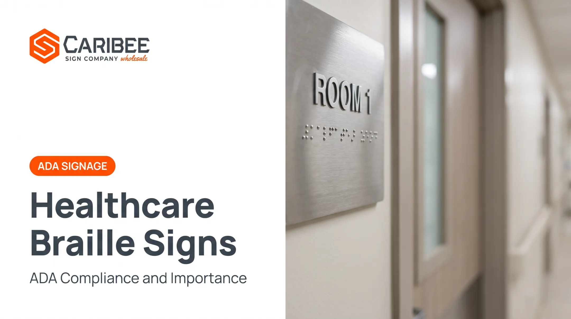
Permanent room signs require raised characters, Grade 2 Braille, non-glare backgrounds, and high-contrast lettering. The 2010 ADA Standards spell out the specifics:
- Raised characters — minimum 1/32 inch above background, uppercase, sans serif
- Grade 2 Braille — positioned below the corresponding text
- Non-glare finish — required on both characters and background
- Contrast — light-on-dark or dark-on-light only
- Mounting height — 48 inches minimum to 60 inches maximum, measured from character baselines Skipping any one of these creates legal exposure and visitor confusion. Regular audits after renovations or department moves keep signage current. Meeting those specs at scale usually means working with a specialized ADA signage manufacturer. Caribee Sign produces room identification, restroom, directional, and Braille signage in stainless steel, brushed metal, acrylic, and frosted composites. Matte and frosted finishes support non-glare requirements, and two-tone color combinations help deliver the high contrast ADA rules require. KPIs impacted:

- Compliance audit pass rates
- Legal risk
- Reorder and fulfillment speed The payoff is highest during new construction and renovations, and for multi-site health systems that need a signage partner they can call repeatedly, not just once.
What Happens When Wayfinding Signage Is Missing or Poorly Designed
Missing or poorly designed wayfinding creates measurable costs in staff time, patient stress, and hospital budgets.
A 2025 Center for Health Design survey of 301 hospital staff found:
- Staff assisted with wayfinding roughly 4 times per week, about 7 minutes per instance
- 31.82 minutes weekly per staff member spent helping people find their way
- Scaled nationally: an estimated 98 million nurse hours annually, equal to over 51,000 full-time positions
- 57% reported frustration, 46% reported distraction, and 44% experienced incivility from people who couldn't find their way

An older estimate pegged wayfinding problems at Emory University Hospital at $220,000 annually. Beyond the dollars, poor signage means:
- Higher patient and visitor stress
- More missed or late appointments
- Visual clutter from reactive, piecemeal fixes
- ADA non-compliance and the legal risk that comes with it
How to Get the Most Value from Healthcare Wayfinding Signage
Wayfinding works best when it's built into planning from day one, not patched in after the fact. That means:
- Reserve effective sign locations during design, not after construction wraps
- Pair physical signs with kiosks and apps; digital tools complement permanent signage, they don't replace it
- Audit after renovations, expansions, or department moves—before confusion sets in
- Work with a responsive manufacturer who knows ADA requirements and turns quotes and production around quickly
Grady Memorial Hospital's 2006 signage overhaul is a useful example: the hospital used color-coded systems and tower-based elevator naming to bring cohesion to a sprawling, multi-building campus that had grown organically over decades.
For sign companies managing healthcare accounts, working with a wholesale partner matters just as much as the design itself. Caribee Sign typically responds to quote requests within one business day, which keeps healthcare projects moving when facilities need signage fast.
Conclusion
Effective wayfinding signage comes down to three things working together: clarity, consistency, and accessibility. Get one wrong and the whole system breaks down for someone trying to find the oncology wing at 7 a.m.
The benefits compound over time. Less patient stress. Smoother staff operations. Stronger ADA compliance. None of that happens by accident.
For sign companies building healthcare wayfinding programs, a dependable ADA-compliant manufacturing partner like Caribee Sign takes one major variable off the table.
Frequently Asked Questions
What is signage in healthcare?
Healthcare signage includes wayfinding, identification, and regulatory (ADA) signs that guide and inform patients, visitors, and staff throughout a facility. It spans everything from exterior directionals to interior room IDs.
What makes hospital wayfinding signage ADA compliant?
ADA-compliant signage requires raised characters, Grade 2 Braille, non-glare finishes, high-contrast lettering, and mounting heights between 48 and 60 inches from the floor. All elements must follow the 2010 ADA Standards, Section 703.
How often should healthcare facilities audit their wayfinding signage?
ADA regulations don't specify a fixed audit interval, but best practice is auditing after every renovation or department move, and at minimum once a year to catch outdated or damaged signage.
Can digital signage fully replace physical wayfinding signs in hospitals?
No. Digital tools like kiosks and apps should complement physical signage, not replace it. Physical signs remain more reliable and accessible, especially for visitors without smartphones or with visual impairments.
Why is ADA-compliant signage important for healthcare facilities?
Non-compliant signage creates legal risk and excludes patients with disabilities from navigating independently. Compliant signage reduces liability while building patient trust and inclusivity.
Who should sign companies partner with for healthcare ADA signage?
Sign companies serving hospitals and clinics need a wholesale manufacturer that delivers consistent ADA compliance on room IDs, Braille signs, and campus wayfinding. Caribee Sign produces custom healthcare signage in-house for trade partners nationwide.