
Introduction
Picture this: a restroom sign arrives at a job site looking flawless. Crisp tactile letters, perfect Grade 2 Braille, strong contrast. Then the inspector's tape measure comes out, and the sign is mounted 62 inches above the floor instead of 60. The job fails. The gorgeous design didn't matter at all.
This happens more often than most sign companies and facility teams expect. Signage placement covers three distinct challenges that rarely get discussed together: visibility and marketing impact, OSHA safety compliance, and ADA legal requirements. Many projects nail one and still fail inspection—or underperform—because the other two were treated as afterthoughts.
This guide breaks down general visibility principles, ADA placement rules, OSHA signage requirements, retail-specific placement strategy, and the mistakes that trip up even experienced sign companies.
Key Takeaways
- Effective placement balances visibility with legal compliance and real customer behavior
- ADA rules are the strictest and most litigated: height, door-side location, and clear floor space all matter
- Match retail and street-facing signs to traffic speed and viewing distance, not just eye level
- An ADA signage specialist reduces compliance risk for sign companies and their clients
General Principles of Effective Signage Placement
Every sign has to clear four hurdles before it does its job: it must be detectable, conspicuous, legible, and comprehensible. Placement determines whether a sign clears any of them.
A sign can be perfectly legible up close and still fail if it's mounted where nobody looks. Placement drives each factor:
- Detectability — location within the visual field
- Conspicuousness — contrast against background clutter
- Legibility — distance and letter size
- Comprehensibility — whether the message registers in the time available
Get the placement wrong, and design quality becomes irrelevant.
Placement for Visibility and Legibility
Letter height and viewing distance have a direct, calculable relationship. The United States Sign Council (USSC) defines a Legibility Index as viewing distance in feet divided by capital letter height in inches. 30 feet per inch is the average benchmark for straightforward viewing conditions, per USSC's Guideline Standards for On-Premise Signs. In cluttered or visually complex environments, that ratio drops closer to 20 feet per inch.
In practice: a sign that needs to be read from 300 feet away requires roughly 10-inch letters under average conditions, more under complex viewing conditions.
Orientation matters too:
- Perpendicular-mounted signs (facing traffic head-on, like blade signs) get read 2 to 4 times farther away than parallel signs of similar size, per USSC field testing
- Parallel-mounted signs (flush against a wall or building face) need sizing based on lane count and lateral offset; simply enlarging them rarely fixes a detectability problem
Height Placement for Pedestrian vs. Vehicle Traffic
"Eye level is buy level" is a common industry principle for pedestrian and in-store signage. Signs positioned at natural eye height get noticed before signs mounted too high or too low. When shelving, displays, or other signage blocks a direct sightline, angling a sign 45 degrees up or down can recover visibility that a flat mount would lose.
Vehicle-facing signage plays by different rules entirely:
- Copy should sit at least 5 feet above grade, with 7 feet recommended to avoid getting blocked by parked or passing vehicles
- Minimum viewing distance depends on speed — faster roadways mean drivers need more reaction distance to read, process, and act on a sign
- Sightline obstructions (trees, other signs, parked cars) shrink effective viewing distance regardless of how tall the sign is

Illumination, Contrast, and Environmental Factors
How a sign is lit changes what placement can achieve. USSC testing found internally illuminated signs consistently outperformed externally lit signs for both daytime and nighttime recognition. High-contrast copy (dark letters on a light background, or light on dark) also reads better than low-contrast pairings, especially after dark.
Nighttime performance drops regardless of illumination quality. USSC recorded 15% shorter recognition distances and 14% shorter legibility distances at night compared to daytime testing.
Before finalizing lighting and placement, check local codes. Municipalities frequently cap illumination levels. San Luis Obispo, California, for example, limits general sign illumination to 100 lux measured 10 feet from the sign face, with tighter limits in office zones. A design that clears company standards can still violate a local ordinance.
ADA-Compliant Signage Placement Requirements
For many interior signs (restrooms, permanent room identification, exits) ADA-compliant placement isn't optional. It's federal law under the 2010 ADA Standards for Accessible Design. Placement errors, not design flaws, are among the most common reasons inspections fail.
Mounting Height and Baseline Rules
The federal rule is specific: tactile character baselines must sit 48 inches minimum to 60 inches maximum above the finished floor (AFF), measured to the baseline of the lowest and highest raised characters respectively, per the ADA's 2010 Standards for Accessible Design.
Many sign professionals use a 54-inch centerline as a practical target, since it splits the difference and provides margin for error on either side. It's an industry best practice, not a separate federal number.
Door-Side and Clearance Rules
Single-door installations follow the latch-side wall rule: the sign mounts on the wall next to the door's latch side, not the hinge side. If there isn't wall space on the latch side, it goes on the nearest adjacent wall.
The federal standard requires 18 x 18 inches of clear floor space centered on the tactile characters. That space must let someone approach and read the sign without standing in the door swing arc. Many specifiers also use a practical 9-inch clearance from the door frame as a rule of thumb drawn from the clear-floor-space requirement.
Double-door situations have their own logic:
- One active leaf, one inactive leaf: mount the sign on the inactive leaf
- Both leaves active: mount on the wall to the right of the doorway
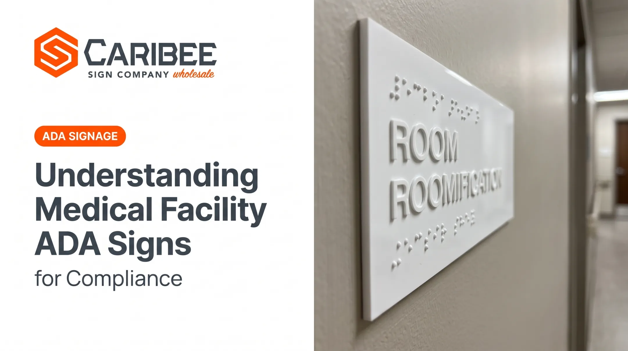
Braille, Tactile Characters, and Pictograms
Tactile signage has to satisfy several dimensional rules simultaneously:
- Grade 2 (contracted) Braille goes below the corresponding tactile text, with a minimum 3/8-inch separation from other tactile elements
- Tactile character height runs 5/8 inch to 2 inches for uppercase letters, with a 1/2-inch minimum allowed when raised and visual characters duplicate each other
- Raised elements must project at least 1/32 inch from the sign surface
- Pictogram fields require a 6-inch minimum height, with no characters or Braille placed inside the field itself
Exemptions and Common Mistakes
Not every sign needs to meet these rules. Federal exemptions include:
- Temporary signs posted for 7 days or fewer
- Company logos and building addresses
- Directories, menus, and seat/row designations
Even so, small errors sink otherwise excellent signage. A tactile sign mounted half an inch outside the 48-60 inch range, or missing the required clear floor space, can delay a certificate of occupancy and force expensive rework after the fact.
To limit that risk, many sign companies buy ADA signs from a specialist manufacturer instead of building them in-house. Caribee Sign, a wholesale ADA manufacturer in St. Louis, Missouri, builds mounting height, tactile specs, and Braille placement into each product before it ships, so fewer compliance details get lost between design and install.

Hugh-Carolina Sign Co., a longtime partner, calls Caribee their go-to for ADA signage that meets requirements out of the box.
OSHA Signage Requirements and Placement
OSHA signage placement prioritizes hazard communication. The goal is keeping people safe in workplaces, warehouses, and construction sites.
The core placement principle is simple: a hazard sign needs to be visible before someone enters the hazardous area, mounted at eye level, and free of obstructions. A caution sign hidden behind a stacked pallet does nothing.
OSHA's 1910.145 standard governs color and legend requirements:
- Danger signs: red, black, and white, reserved for the most severe hazards
- Caution signs: yellow background with a black panel and yellow lettering
Signal words must be easy to read, factually accurate, and specific about the hazard—not vague.
ANSI Z535 supplements OSHA's baseline rules with clearer severity tiers:
- DANGER: hazard likely to cause death or serious injury
- WARNING: hazard that could cause death or serious injury
- CAUTION: hazard involving minor to moderate injury risk
Color-coding and legend placement details are spelled out in the full ANSI Z535.2 standard.
Legibility in low light matters too. OSHA doesn't set a blanket illumination requirement for general safety signage, but exit signs specifically require 5 foot-candles of illumination, unobstructed sightlines, and lettering at least 6 inches high, per 1910.37.
One placement habit worth building into facility management: audit signage every time a layout changes. A caution sign that was perfectly placed before a new shelving unit went in might now be blocked from view.
Retail Signage Placement Best Practices
Retail signage placement means positioning signs to influence how customers move through a space and what they buy: at entrances, checkout counters, aisle ends, and anywhere a purchase decision gets made.
eMarketer forecasts that brick-and-mortar stores will account for 82.9% of U.S. retail sales in 2025. In-store signage placement still carries real weight.
Placement should follow the customer's natural path through the store, not fight against it:
- Position signage near related products, not just at random high-visibility spots
- Use entrance signage to set expectations before shoppers commit to browsing
- Place promotional signage at aisle ends, where foot traffic naturally slows down
Window and Storefront Signage
Storefront signage placement has its own logic. Viewing distance from the sidewalk, street-level sightlines, and pedestrian speed all factor into sizing and height decisions. The same visibility logic used for vehicle-facing signs applies here, just at a much shorter distance.
One detail businesses sometimes forget: exterior retail signage still has to respect local ADA and zoning placement rules, even when it's purely promotional. A window sign that projects too far into a walkway, for example, can run into the same protruding-object clearance issues that apply to interior signage.
Common Signage Placement Mistakes to Avoid
Most placement failures fall into a handful of repeat offenders. Watch for these:
- Mounting height mismatched to the audience — a sign sized for adult eye level that a wheelchair user or child can't see comfortably
- Sizing letters without accounting for viewing distance — a sign that looks fine on a workbench but disappears at 50 feet
- Blocked sightlines — door swings, product displays, or other signage cutting off the view
- Skipping ADA clearances — no 18x18-inch clear floor space, or less than 9 inches from the door edge latch side
- Installing tactile signs on active door leaves instead of the latch-side wall or inactive leaf

Multi-location businesses face an added layer of risk. Franchises, commercial property managers, and multi-site retailers often end up with inconsistent placement from one site to the next — one store gets it right, another doesn't, and the whole brand carries the compliance exposure.
Standardized placement guidelines and a consistent manufacturing partner prevent that drift. When every location's ADA signs come from the same specialist who produces to federal placement standards, sign companies spend less time fixing field errors and more time installing.
Frequently Asked Questions
Where should signs be placed?
Placement depends on the sign type:
- ADA signs: latch-side wall at 48–60 inches above the finished floor
- Retail signs: high-traffic zones at eye level
- Vehicle-facing signs: distance-based sizing at driver sightline height
What are the OSHA requirements for signage?
OSHA requires hazard and safety signs to be placed at eye level, unobstructed, and visible before entering a hazardous area. Color and legend format follow ANSI Z535 and OSHA 1910.145 standards.
What is retail signage placement?
Retail signage placement means positioning signs at entrances, checkout areas, and aisle ends so they align with how customers actually move through a store and where they make purchase decisions.
How high should ADA signs be mounted?
Federal rules require tactile character baselines between 48 inches minimum and 60 inches maximum above the finished floor. A 54-inch centerline is a common industry best practice, not a separate federal requirement.
Do ADA signs need Braille at every location?
No. Permanent interior signs identifying rooms, restrooms, and exits require Grade 2 Braille. Temporary signs (7 days or fewer), logos, and directories are exempt from this requirement.
What happens if signage placement doesn't meet ADA requirements?
Non-compliant placement can delay certificates of occupancy, trigger costly retrofits, and expose businesses to DOJ complaints or lawsuits. Sourcing from an ADA-focused manufacturer like Caribee Sign reduces that risk.