
Introduction
A sign's finish gets less attention than material or color, but it still decides the outcome. It shapes glare under fluorescent lights, how a wayfinding sign holds up after years of hallway traffic, and whether a facility passes an accessibility audit.
Many sign companies and business owners treat finish as an afterthought, something decided after the material and color are locked in. That's a costly mistake. The wrong finish can create glare that makes tactile signage illegible for visually impaired users, or it can fade and scratch faster than expected in high-traffic environments.
The 2010 ADA Standards specifically require a non-glare finish on accessible signage, plus contrast between characters and their background. Many standard gloss finishes fail that test outright.
This guide breaks down the major finish types, how ADA and ANSI rules shape your options, and how to pair finish with color for signage that looks sharp and stays compliant.
Key Takeaways
- Finish affects glare, durability, and readability as much as material or color choice does.
- ADA and ANSI A117.1 non-glare and contrast rules rule out many glossy finishes.
- Use matte indoors and on text-heavy or high-touch signs; use gloss outdoors for visibility.
- Pair finishes—e.g., gloss accents on a matte base—to build hierarchy without losing compliance.
What Are Sign Finishes and Why Do They Matter?
A sign finish is the coating, laminate, or surface texture applied over a printed or painted sign. It's the layer between the design and the outside world, and it determines how that design holds up.
Finish plays three roles at once:
- Aesthetics: sets the visual tone, from a soft matte look to a mirror-bright metallic shine
- Durability: resists UV fading, scratches, and weather exposure
- Functionality: controls glare and preserves legibility, especially under bright or angled light
Finish choice isn't independent of material. Vinyl, acrylic, aluminum, and ADA-grade substrates each accept certain finishes better than others, and the application method (printed, painted, laminated, or engraved) narrows the options further.
The Cost of Getting It Wrong
Get the finish wrong and the consequences show up fast. A gloss finish in a sun-drenched storefront window can wash out in direct light. A matte finish without UV protection on an outdoor sign may fade well before its expected replacement cycle.
Lamination quality matters here, too. Manufacturer warranty data from ORAFOL's matched media-and-laminate systems shows protected sign assemblies rated for 3 to 7 years of service life, depending on the specific laminate and exposure conditions.
The right protective layer, matched to the right substrate, extends usable life well beyond an unprotected surface.
Finish options vary widely from here, and each type solves a different problem. Here's how they break down.
Types of Sign Finishes Explained
Every finish trades off between shine, protection, and legibility. Choosing the right one starts with understanding what each does well.
Gloss Finish
Gloss finishes reflect light and intensify color saturation. That reflective quality makes colors pop from a distance, which is exactly why gloss dominates outdoor signage, storefront displays, and anything competing for attention on a busy street.
Matte Finish
Matte finishes diffuse light instead of bouncing it back. That means less glare, fewer visible fingerprints, and easier reading under harsh overhead lighting. It's the go-to choice for indoor signage, directories, and anything text-heavy where legibility matters more than shine.
Metallic Finish
Metallic finishes replicate the look of brushed or polished metal, often applied directly to aluminum or acrylic substrates. Caribee Sign produces this look using brushed metal and polished treatments on ADA and directory signage, giving offices and lobbies a clean, upscale feel without the cost of solid metal fabrication.
Reflective Finish
Reflective finishes embed materials that bounce light directly back toward its source, such as headlights. This makes them essential for road signs, parking signage, and any application where nighttime visibility is a safety requirement, not just a preference.
Textured Finish
Textured finishes mimic wood grain, stone, or brick through vinyl wraps or specialty laminates. They deliver a bold decorative statement, common in hospitality and retail settings, without the weight or cost of the actual material.
Laminated Finish
Laminated finishes add a clear protective layer over the printed surface, guarding against scratches, moisture, and UV fading. It's available in both matte and gloss variants, so you don't have to sacrifice one benefit for the other.
Satin and Specialty Finishes
A few middle-ground and premium options round out the list:
- Satin/luster — moderate sheen, splits the difference between matte and gloss
- Soft-touch — a velvety texture often used for premium branding
- Ultra-matte — near-zero reflection, ideal for high-glare environments

Sign Finishes and ADA Compliance: Why Non-Glare Matters
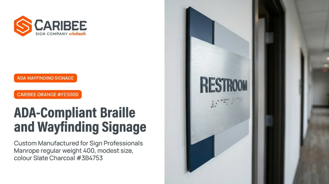
ADA and ANSI A117.1 standards require tactile and Braille signage to carry a non-glare finish on both characters and background. Non-glare is a legibility requirement: people with low vision depend on contrast to read a sign, and shine undercuts that contrast.
What "Non-Glare" Actually Means
The 2010 ADA Standards require characters to contrast with their background—light-on-dark or dark-on-light—but they do not set a numeric contrast ratio.
ANSI's ICC A117.1-2017 goes further. It caps finish glare at 19 gloss units on a 60-degree gloss meter, a threshold you can measure and test.
Here's why that matters in practice:
- Glossy or reflective finishes scatter light unpredictably under overhead lighting
- That scattered light creates visual "noise" that obscures raised characters and Braille dots
- Low-vision users lose the contrast edge they depend on to read the sign at all
Matte and non-glare finishes solve this. They meet the compliance standard.
The Liability Side of Getting This Wrong
Compliance failures carry real consequences. In a Department of Justice settlement with St. Luke's Hospital and Health Network, the agreement required TTY location signs to use eggshell, matte, or another non-glare finish with proper character-to-background contrast. St. Luke's admitted no liability, but the remedy itself shows how seriously regulators treat finish and contrast on accessible signage.
For sign companies fulfilling ADA orders at scale, that's a lot of risk riding on a finish decision. Caribee Sign manufactures ADA and tactile signage with non-glare finishes and compliant contrast built in from the start. Wholesale partners get a sourcing option that does not require re-checking every batch for glare violations.
How to Choose the Right Finish for Your Sign
Finish selection comes down to four practical factors:
- Location — indoor signage can handle more delicate finishes; outdoor signage needs UV and weather resistance
- Ambient lighting — bright, direct light calls for matte or non-glare options; dim interiors can support more reflective finishes
- Durability and maintenance — high-touch areas like restrooms benefit from scratch-resistant laminates
- Brand aesthetic — matte reads as modern and understated; gloss and metallic read as bold and premium
Combining finishes on a single sign is common practice, too. A glossy logo set against a matte background creates visual hierarchy, drawing the eye to the brand mark while keeping the surrounding text glare-free and easy to read.
When ADA compliance is required, consult a manufacturer who works with finish requirements daily. Caribee's production team fields these questions from wholesale partners regularly and can match finish to the application and code.

Sign Colors: Meaning and Best Practices
Color and finish decisions work together. Each one changes how the other performs on the wall.
Standard Color Associations
Signage color conventions are well established across commercial and safety contexts:
- Red — warning, stop, urgency
- Green — go, safety, clearance
- Blue — trust, information, wayfinding
- Yellow — caution, attention
What Actually Drives Legibility
Color alone isn't the strongest predictor of how well a sign gets noticed or read. A 2017 peer-reviewed review of sign visibility research found that luminance contrast has a bigger impact on legibility than hue-based color psychology. Luminance contrast is the brightness difference between characters and background. Color can boost conspicuity, but contrast is what makes text readable in the first place.
That is why ADA rules focus on contrast orientation rather than specific colors. Light characters on a dark background, or dark characters on a light background, meet the requirement regardless of hue.
Finish Changes How Color Reads
The same color looks different depending on finish. Gloss intensifies saturation and can create hotspots under direct light. Matte softens color and keeps it consistent across viewing angles. Choose finish and color together, not one after the other—especially on ADA signage, where both affect legibility for low-vision readers.
Frequently Asked Questions
What are the different sign finishes?
The main types are gloss, matte, metallic, reflective, textured, laminated, and satin/specialty finishes like soft-touch or ultra-matte. Each serves a different purpose, from outdoor visibility to indoor glare reduction to decorative texture.
What are the best colors for signs?
The best color depends on visibility needs, brand psychology, and required contrast. High-attention colors like red, yellow, and blue perform well, but contrast between character and background matters more than hue alone.
What do the colors of signs mean?
Red typically signals warning or stop, green means go or safety, blue conveys trust or information, and yellow indicates caution. These associations are standard across commercial and safety signage.
Does ADA require a specific sign finish?
ADA and ANSI standards require a non-glare finish plus contrasting characters and background on accessible signage. Caribee Sign specializes in producing ADA signage that meets these finish and contrast requirements from the start.
Should I choose matte or gloss for outdoor signage?
Gloss is generally preferred outdoors because it boosts visibility and color vibrancy from a distance. Matte with UV lamination is a solid alternative in high-glare settings where reflection becomes a problem.
Can multiple finishes be combined on a single sign?
Yes, this is a common practice. A glossy logo over a matte background is a typical example, creating visual contrast while keeping surrounding text glare-free.