
Introduction
Picture a visitor stepping off the elevator in a seven-story hospital, looking for Radiology, with no signs pointing the way. Blood pressure creeps up, stress kicks in, and a five-minute walk turns into a fifteen-minute ordeal.
That frustration isn't rare. Disorientation in healthcare settings is directly linked to stress, anxiety, and even physical symptoms like headaches and fatigue, according to the Center for Health Design's wayfinding position paper. Good wayfinding signage removes that friction entirely.
Effective wayfinding blends architecture, psychology, and code compliance into one system. Nail that mix, and visitors move through the building with confidence. Miss it, and even a beautifully designed space turns into a maze for anyone without an escort.
This guide covers the core types of wayfinding signage, the design principles that make them work, ADA requirements you can't skip, and the mistakes that undermine otherwise solid systems.
Key Takeaways
- Wayfinding signage must function as one coordinated system across the entire property
- ADA compliance covers tactile characters, Braille, contrast, and mounting height
- Consistent terminology, color, and placement reduce cognitive load at every decision point
- Environment shapes strategy: healthcare, campus, and transit spaces each need different approaches
Understanding the Types of Wayfinding Signage
A true wayfinding system answers three questions at every turn: Where am I? Where do I want to go? How do I get there? No single sign can do all three. That's why facilities rely on four coordinated sign types working together.
Directional Signage
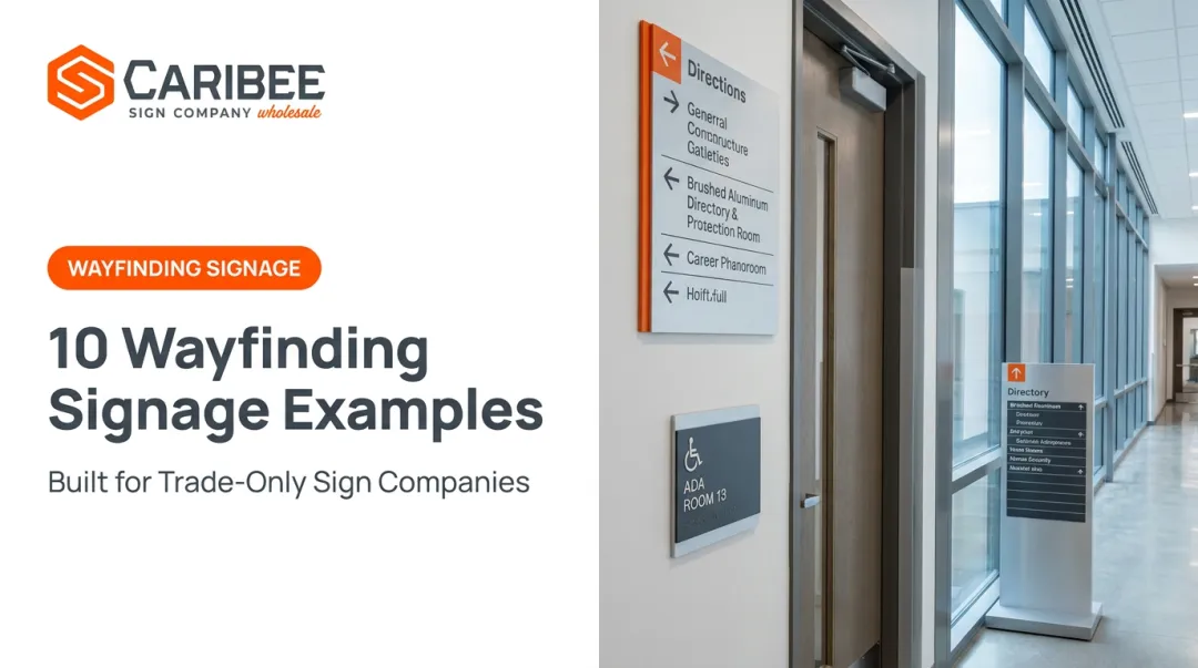
Directional signs guide movement. They appear at intersections, entrances, and elevator lobbies, using arrows and overhead placement to point toward the next decision point.
Hospitals often color-code these paths, matching directional arrows to specific departments so patients can follow a color rather than memorize a room number sequence.
Identification Signage
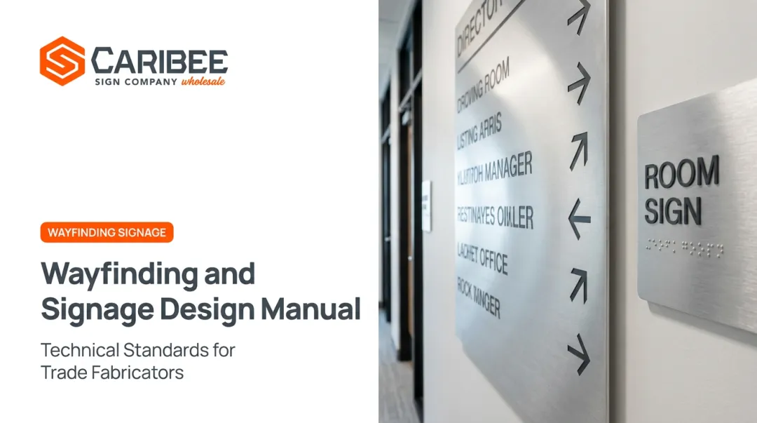
Identification signs confirm arrival. Room numbers, department names, and suite labels fall into this category, and most must include tactile lettering and Braille under ADA rules.
Unlike directional signs, these are permanent fixtures tied to a specific room or space, not a moving decision point.
Informational Signage
Informational signs add context without directing traffic. Think hours of operation, facility rules, or a "You Are Here" map at a building entrance.
These signs support navigation but don't command it. They fill in gaps that directional and identification signs leave open.
Regulatory and Safety Signage
Regulatory signs carry legal weight. Fire exits, occupancy limits, and accessibility notices fall under this umbrella, and they're often subject to strict building and fire code requirements beyond standard ADA rules.
According to the Center for Health Design, effective wayfinding depends on a logical, consistent system built from these four types rather than four types working in isolation.

Core Design Principles and Guidelines for Effective Wayfinding Signage
Good wayfinding design comes down to a handful of repeatable principles. Skip one, and the whole system starts to feel disjointed.
Clear Messaging and Strategic Placement
A sign that reads "Proceed to the elevator bank located adjacent to the main reception area for access to upper floors" will lose readers before they finish the sentence. Compare that to a simple arrow icon labeled "Elevators."
Universal symbols solve this problem at scale. The AIGA and U.S. Department of Transportation developed a set of 50 standardized pedestrian symbols specifically so travelers could navigate regardless of language.
Signs only work if they show up exactly where people need to make a choice:
- Intersections and hallway junctions
- Building entrances and lobbies
- Elevator lobbies and stairwell landings
- Major transitions between wings or floors
Mounting height and unobstructed sightlines matter just as much as content. A perfectly worded sign hidden behind a plant or mounted too high does nothing.
Consistency and Visual Hierarchy
One font family, one color palette, one material finish, used everywhere. That consistency reduces cognitive load because users learn the "visual language" once and apply it across the entire building or campus.
Inconsistent signage forces visitors to relearn navigation cues at every new hallway, which defeats the purpose of a coordinated system. This same logic applies to how information is prioritized on each sign: not every detail deserves equal visual weight.
Primary destinations should dominate a sign or map, while secondary details, like a suite number, stay smaller and lower in the hierarchy. The Center for Health Design specifically recommends no more than three directional options per sign to avoid overwhelming the reader at any single decision point.
Orientation Aids and Landmarks
"You Are Here" indicators and maps give people a mental anchor. Combined with recognizable landmarks, such as a distinct piece of art or a color-coded zone, these aids help visitors build a working map of the space in their head rather than relying on signs alone.
ADA Compliance and Accessibility in Wayfinding Design
Inclusive design isn't a nice-to-have add-on. It's a legal requirement under the ADA, and it directly shapes how identification and regulatory signage get manufactured.
Tactile and Braille Requirements
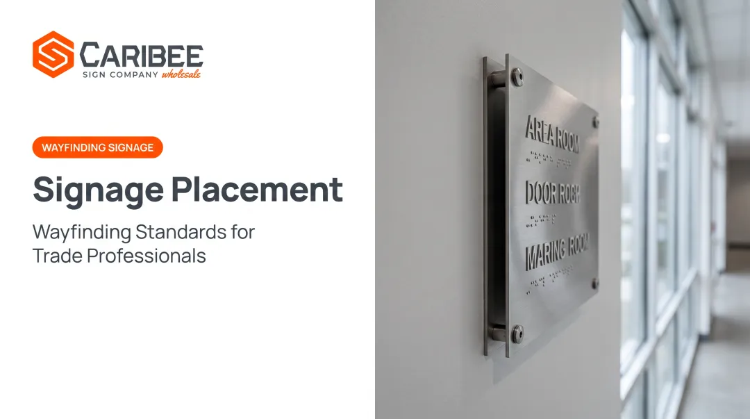
Permanent room signs must include raised tactile characters and Grade 2 Braille. The U.S. Access Board's Section 703 standards spell out exact specifications:
- Raised characters: uppercase, sans serif, at least 1/32 inch raised
- Character height: 5/8 to 2 inches depending on sign type
- Braille: positioned below tactile text, at least 3/8 inch from any border or decoration
- Mounting: tactile baseline between 48 and 60 inches above the floor

These aren't suggestions. Miss the spacing tolerance on Braille dots by a fraction of an inch, and the sign fails inspection.
Contrast and Visual Character Standards
The ADA requires non-glare finishes with high contrast, either light characters on a dark background or the reverse. Notably, the standards don't specify an exact numeric contrast ratio, so relying on a made-up percentage isn't a substitute for testing against the actual code language.
Visual character height also scales with viewing distance and mounting height, meaning a directional sign mounted 10 feet up needs much larger lettering than a room ID sign at eye level.
Why Compliance Matters at Scale
More than 1 in 4 U.S. adults lives with a disability, according to the CDC's Disability Impacts All of Us data, spanning cognitive, mobility, hearing, and vision conditions. That's not a niche accommodation. It's a baseline expectation for any public-facing building.
Non-compliant signage creates real legal exposure, and it locks people out of spaces they have every right to access.
This is exactly why sign companies partner with manufacturers who specialize in ADA production. Caribee Sign, for example, produces tactile characters and Grade 2 Braille in-house using CNC routing and precision laser engraving, so every sign meets Section 703 specs before it ships.
Sign companies submitting wayfinding projects don't need to supply Braille copy either; Caribee handles translation internally, which removes one more compliance risk from the process.
Wayfinding Signage Design Across Different Environments
Wayfinding isn't one-size-fits-all. Each environment brings its own pressures:
- Healthcare facilities: stressed, unfamiliar visitors need color-coded zones and simple pictograms
- Educational campuses & corporate offices: multi-building layouts need seamless exterior-to-interior signage handoffs
- Transit hubs, retail centers & public spaces: multilingual, high-traffic crowds need standardized icons and weather-resistant materials
Seattle Children's Hospital shows this in practice. It assigns each zone a name, color, and icon, then repeats that same cue across directories and directional signs so it never changes as visitors move deeper into the building.
Educational campuses and corporate offices raise a different issue. Exterior directional signage has to hand off cleanly to interior identification signs once someone reaches the right building. Miss that handoff, and visitors get lost right at the doorstep.
Transit hubs, retail centers, and public spaces answer to a different crowd, one that may not share a common language.
The APTA's Transit Universal Design Guidelines recommend concise text paired with standardized pictograms because they read across language barriers.
Sign companies serving any of these markets need a wholesale partner covering all three. Caribee Sign produces wayfinding systems for healthcare, education, and transit projects alike, giving trade partners one reliable source instead of multiple vendors.
Common Wayfinding Signage Design Mistakes to Avoid
Even well-intentioned wayfinding systems fail for predictable reasons:
- Overloading signs with information — cramming five directional options onto one sign forces users to stop and decode instead of glancing and moving
- Inconsistent terminology or color — calling the same department "Radiology" on one sign and "Imaging" on the next erases the trust a consistent system builds
- Poor placement or low contrast — a sign mounted above sightline or printed in low-contrast colors might as well not exist
- Non-ADA-compliant mounting heights — even a well-designed sign fails inspection if it sits outside the 48–60 inch tactile range

One documented example makes this concrete: a large public hospital installed roughly 5,000 static signs, yet nearly every surveyed visitor still had to reconfirm directions along the way. Most couldn't navigate using the signage alone. A coordinated system with consistent terminology, proper contrast, and ADA-compliant placement fixes what additional signage alone cannot.
Choosing the Right Manufacturing Partner for ADA-Compliant Wayfinding Signage
Sign companies handling wayfinding rollouts need a production partner who won't introduce delays or compliance gaps into an already complex project. That means evaluating potential partners on more than price alone.
Look for a manufacturer who offers:
- Compliance expertise: In-house knowledge of Section 703 specs, not just a general familiarity with "ADA signs"
- Turnaround reliability: Consistent quote and production timelines, especially for multi-location rollouts
- Ease of collaboration: A straightforward quote request process that doesn't require chasing down answers
Caribee Sign has built its wholesale model around exactly this kind of reliability. As Hugh Welch of Hugh-Carolina Sign Co. put it:
"They're our 'go-to' company for all of our ADA signage needs. They're easy to work with, super responsive, and deliver high-quality products that meet all requirements."
That kind of dependable partnership matters most on large-scale wayfinding projects, where a single production delay can stall an entire building rollout. Before starting your next wayfinding project, vet potential partners the same way: ask about compliance processes, request a sample turnaround, and see how easy the quote process actually is.
Frequently Asked Questions
What are the design guidelines for wayfinding signage?
Good wayfinding relies on clear, concise messaging, strategic placement at decision points, and consistent fonts, colors, and materials throughout the system. Accessibility features round out a complete, effective design.
What are the main types of wayfinding signage?
The four core types are directional (guides movement), identification (confirms arrival), informational (adds context), and regulatory or safety signage (communicates rules and legal requirements).
How does ADA compliance affect wayfinding signage design?
ADA compliance dictates tactile character and Braille specifications, contrast and finish requirements, font sizing based on viewing distance, and mounting height between 48 and 60 inches.
What materials work best for wayfinding signage?
Durable, weather-resistant substrates like aluminum, acrylic, and specialty composites hold up well both indoors and outdoors. The right material still has to meet ADA finish and contrast rules regardless of what it's made from.
How often should wayfinding signage be updated?
There's no universal fixed interval, but audits are recommended after major layout changes, renovations, or visible wear. Older facilities with neglected signage should schedule a full review sooner rather than later.
How do I get started on a wayfinding signage project?
Most projects start with a site assessment followed by a consultation with a wholesale signage manufacturer like Caribee Sign. From there, a quote request typically includes project specs, signage type, and any relevant files or artwork.