
That scene repeats itself constantly. In fact, a 2025 staff survey found hospital employees spend an average of 31.82 minutes per week giving directions, adding up to an estimated 98 million nurse-hours annually across U.S. hospitals. That's time pulled straight from patient care.
This guide breaks down what actually makes hospital wayfinding work: design principles, signage types, ADA requirements, and how digital tools fit into the mix. You'll also find ways to measure whether your current system is helping or hurting.
Key Takeaways
- Poor wayfinding costs hospitals real staff time and increases visitor frustration
- ADA compliance requires specific measurements for raised characters, Braille, and mounting height
- Effective systems combine directional, identification, informational, and regulatory signage
- Digital tools should supplement physical signs, not replace them
- Regular audits catch outdated signage before it confuses visitors
Why Wayfinding Signage Matters in Healthcare Facilities
Hospitals aren't designed like retail stores with a single logical path from entrance to checkout. They're sprawling, often expanded over decades, with wings bolted onto wings and departments relocated as needs shift. A visitor navigating this maze isn't just annoyed — they're frequently already stressed about a diagnosis, a loved one's condition, or a procedure.
The same 2025 survey found staff rated wayfinding as harder for visitors than for themselves, and the toll goes both directions:
- 46% of staff reported feeling distracted by frequent direction requests
- 57% reported frustration
- 44% experienced incivility from visitors who were already frustrated by getting lost
A separate peer-reviewed review found that posting clear signage in admitting areas correlated with fewer staff demands and better visitor understanding of procedures and amenities. Clear wayfinding is an operational lever that affects staff bandwidth, visitor stress, and how smoothly a facility runs day to day.

Types of Hospital Wayfinding Signage
A functioning wayfinding system layers several sign categories together. Skip one, and the whole chain breaks down.
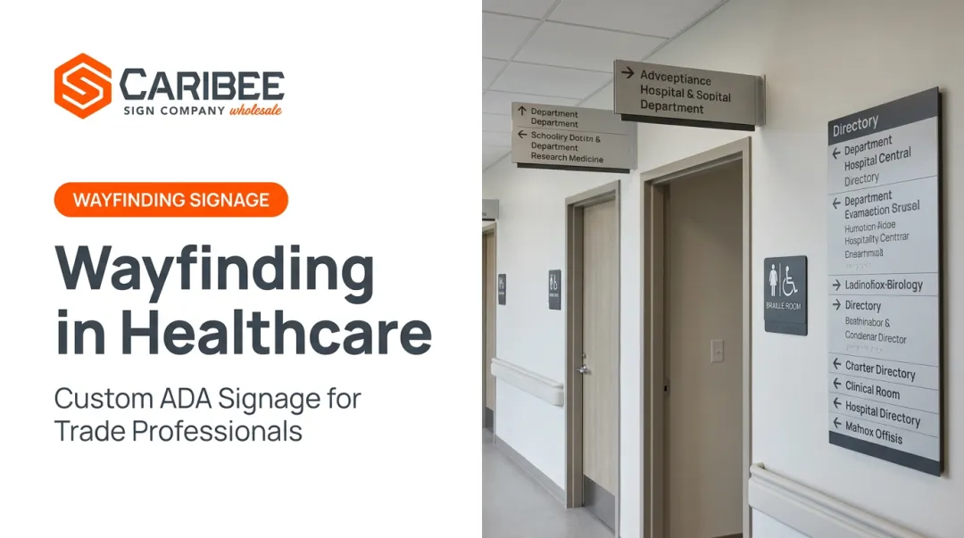
Directional signs sit at decision points (corridor intersections, elevator lobbies, and junction points), pointing visitors toward their next move. Research on hospital outpatient navigation found directional signage was the visual content visitors relied on most heavily at these choice points.
Identification signs confirm arrival. These mark room numbers, department entrances, and office doors, and they need to match the terminology used on directional signs exactly. A mismatch here (calling it "Radiology" on one sign and "Imaging" on another) undoes the trust visitors place in the system.
Informational signs include directories, floor plans, and maps, typically clustered in lobbies and major junctions. These carry more detail and should stay separate from urgent directional cues so visitors aren't overwhelmed mid-route.
Regulatory/ADA signage covers legally required elements: restroom identification, exit routes, and accessible-path markers.
Digital and interactive signage (kiosks and searchable directories) supplements the static system. More on this below.
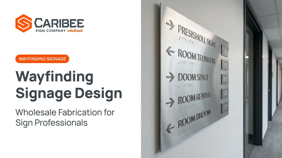
Caribee Sign manufactures all four physical categories for healthcare projects: ADA-compliant directional and room-ID signs, directories, and regulatory and evacuation-route signage. Sign companies get a single production partner when a hospital job needs every category covered.

Core Design Best Practices for Effective Wayfinding
Consistency Builds Trust
Uniform fonts, colors, and terminology across every sign in the building let visitors build a mental model they can rely on. Once they learn that blue text always means "clinical department," breaking that pattern anywhere in the building erodes confidence in the whole system.
Universal symbols and pictograms paired with plain-language text matter just as much. Non-English speakers and visitors with limited literacy depend on icons for restrooms, elevators, and accessible routes. The SEGD/Hablamos Juntos healthcare symbols project tested and refined a set of 50 icons specifically for this purpose.
ADA Compliance Details That Actually Get Missed
The federal ADA standards are specific, and getting them wrong means costly rework. Key requirements:
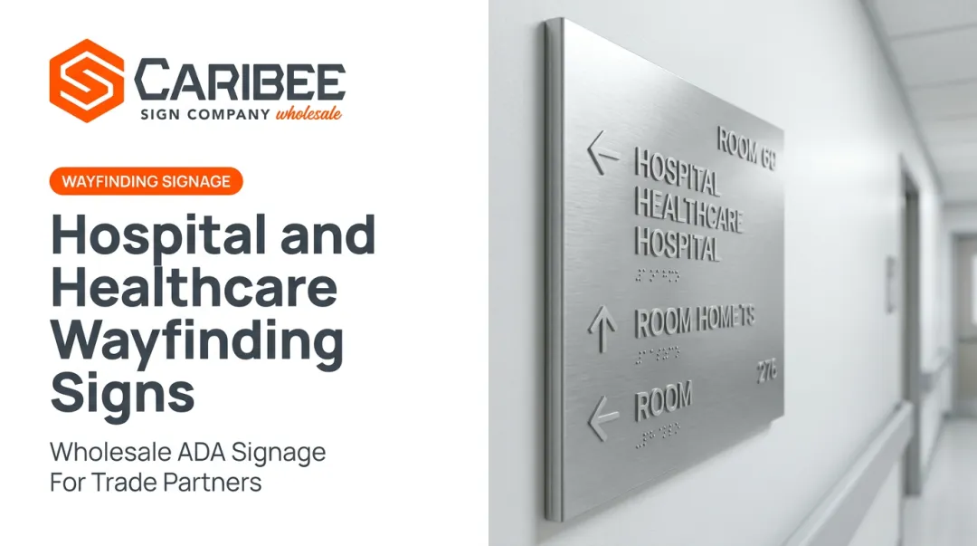
- Raised characters: minimum 1/32-inch relief, uppercase, sans serif, 5/8 to 2 inches tall
- Grade 2 Braille: contracted Braille, positioned below the corresponding text
- Mounting height: tactile characters between 48 and 60 inches above finish floor, measured at baseline
- Contrast and finish: non-glare backgrounds with high visual contrast between characters and background
Caribee Sign manufactures ADA-compliant signage that incorporates these exact specifications (raised tactile characters, Grade 2 Braille, and high-contrast finishes) in materials ranging from stainless steel and brushed metal to frosted acrylic and wood. For sign companies handling hospital contracts, a manufacturing partner who already builds to these tolerances reduces compliance risk.

Reinforcing the Path Visually
Color-coded zones or floor graphics give visitors a secondary cue beyond text signage. In large campuses, that extra cue matters: a wrong turn can mean a five-minute walk back.
Hospitals also renovate and relocate departments constantly, so schedule signage audits after every major construction project or department move. Outdated signs pointing to a department that moved two floors down aren't just unhelpful. They actively damage trust in every other sign in the building.
Strategic Signage Placement and Wayfinding Flow
Mapping the Patient Journey
Concentrate signage at genuine decision points: entrances, elevator banks, corridor intersections, and waiting-area exits. Research using spatial analysis in hospital outpatient settings found that stopping to reorient was the most common visitor behavior. Directional signage at these junctions had the strongest effect on successful navigation.
Rather than dumping every piece of information at the entrance, use progressive disclosure:
- Confirm the general direction at the entrance (building/wing level)
- Narrow to the floor or department at elevator banks
- Confirm the specific room only once the visitor is close
This keeps each sign digestible instead of forcing visitors to parse a wall of text before they've even found the elevator.

Sign Hierarchy
Build the system top-down:
- Campus level
- Building/entry
- Floor or department
- Room-level identification
Freeze destination names early and map every decision point before assigning sign content. Changing terminology mid-project is where consistency usually breaks down.
Blending Physical Signage with Digital Wayfinding Tools
Interactive kiosks and mobile apps add real value when they support—not compete with—on-site signs:
- Searchable directories for departments and clinics
- Turn-by-turn directions to destinations
- QR codes that open browser-based maps without an app download
Browser-based maps and printable directions also help visitors who aren't comfortable with mobile technology.
Digital tools should enhance physical signage, not replace it. Not every visitor, especially older patients or those under stress, will reach for a kiosk or app. Physical signs remain the fallback everyone can use.
If you add digital directories, treat them as a maintenance commitment. A kiosk pointing to the old location of Oncology is worse than no kiosk at all. Update digital maps the moment a department moves, alongside physical signage updates.
Measuring the Effectiveness of Hospital Wayfinding
You can't improve what you don't track. Useful KPIs include:
- Direction-request frequency: how often staff get stopped for directions, and how long each interaction takes
- Time-to-destination: how long it takes visitors to reach a target department
- Staff interruption impact: self-reported frustration or distraction tied to wayfinding questions
- Missed or late appointment rates: tracked alongside known wayfinding trouble spots
Beyond raw numbers, run periodic wayfinding audits. Walk the actual visitor path yourself, note where signage contradicts itself or goes missing, and watch real visitors navigate if possible.
Staff feedback is an underused resource. The people fielding direction requests every day usually know exactly which hallway or elevator lobby trips people up most often.
Frequently Asked Questions
What are the types of hospital wayfinding signage?
Hospital wayfinding typically includes directional signs (arrows, corridor guidance), identification signs (room and department names), and informational signs (directories, maps). Facilities also use regulatory/ADA signage for restrooms, exits, and accessible routes, plus digital options like kiosks.
What is the difference between signage and wayfinding?
Signage refers to individual signs, such as a single directional arrow or room label. Wayfinding is the entire system of maps, symbols, color coding, and landmarks that guides someone through a building.
How much does hospital wayfinding signage cost?
Cost varies based on facility size, sign materials (stainless steel, acrylic, wood), sign types needed, and whether digital elements are included. Because every project differs, getting a custom quote is the most accurate way to budget.
What symbols are commonly used in hospital wayfinding signage?
Common pictograms include wheelchair accessibility, restrooms, elevators, and emergency exits. The ADA specifically recognizes the International Symbol of Accessibility along with TTY and assistive-listening symbols for regulatory signage.
What KPIs measure the effectiveness of hospital wayfinding?
Key metrics include patient satisfaction scores, time-to-destination, frequency of staff direction-giving, and missed or late appointment rates tied to specific navigation trouble spots.
What is an example of hospital wayfinding signage?
One example is a color-zoned path from parking to a department, paired with ADA-compliant room signs. Caribee Sign has produced teal two-tone ADA room signs with raised numerals, Grade 2 Braille, and embossed branding text, showing how compliance and identity can share one sign.